Cards & Wallets · Mobile SDK · UI Components
Card Input
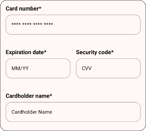
The Card Input component is used to collect card information from the user. It consists of three fields — PAN, expiry date and CVV — and also includes a field for the cardholder’s name.
Parameters
| Parameter | Description |
|---|---|
backgroundRadius | (Optional) The radius of the background in the card input. Defaults to 0.dp. |
labelLocation | (Optional) The location of the label in the card input. Defaults to LabelLocation.TOP. |
labelTextSize | (Optional) The size of the label text in the card input. Defaults to 14.sp. |
labelTextFontWeight | (Optional) The font weight of the label text in the card input. Defaults to ComponentFontWeight.NORMAL. |
labelComponent | (Optional) The component used to display the label in the card input. Defaults to a Text component. |
fieldTextSize | (Optional) The size of the field text in the card input. Defaults to 14.sp. |
fieldTextFontWeight | (Optional) The font weight of the field text in the card input. Defaults to ComponentFontWeight.NORMAL. |
showCardHolderName | (Optional) If true, the cardholder’s name field is shown. Defaults to true. |
modifier | (Optional) Modifier for styling the card input component. |
For uses other than Compose you can use CardInputStyleState to define the styling.
Example usage
Compose Multiplatform
Kotlin
CardInput(
  backgroundRadius = 8.dp,
  labelLocation = LabelLocation.TOP,
  labelTextSize = 16.sp,
  labelTextFontWeight = ComponentFontWeight.BOLD,
  labelComponent = { label, labelTextStyle ->
      Text(
          text = label,
          style = labelTextStyle,
          modifier = Modifier.padding(vertical = 8.dp)
      )
  },
  fieldTextSize = 16.sp,
  fieldTextFontWeight = ComponentFontWeight.NORMAL,
  showCardHolderName = true,
  modifier = Modifier.padding(16.dp)
)
Android View
XML
<com.accesspaysuite.mobilesdk.ui.card.CardInputView
  android:id="@+id/cardInput"
  android:layout_width="match_parent"
  android:layout_height="wrap_content" />
Kotlin
val cardInput = findViewById<CardInputView>(R.id.cardInput)
cardInput.init(state = CardInputStyleState())
iOS
Create the controller representable
Swift
import SwiftUI
import mobilesdk

struct CardInputControllerRepresentable: UIViewControllerRepresentable {
  @Binding var state: CardInputStyleState

  init(state: Binding<CardInputStyleState>) {
      self._state = state
  }

  func makeUIViewController(context: Context) -> UIViewController {
      return CardInputController().make()
  }

  func updateUIViewController(_ uiViewController: UIViewController, context: Context) {
      CardInputController().update(state: state)
  }
}
Create the CardInput view
Swift
import SwiftUI
import mobilesdk

struct CardInput: View {

  @Binding var state: CardInputStyleState

  init(state: Binding<CardInputStyleState>) {
      self._state = state
  }

  var body: some View {
      CardInputControllerRepresentable(
          state: $state
      )
      .frame(height: 400)
      .ignoresSafeArea(.keyboard)
      .onTapGesture {
          UIApplication.shared.sendAction(#selector(UIResponder.resignFirstResponder), to: nil, from: nil, for: nil)
      }
  }
}
Use the CardInput view
Swift
import SwiftUI
import mobilesdk

struct PaymentView: View {

  @State private var styleState = CardInputStyleState()

  var body: some View {
      CardInput(
          state: $styleState
      )
  }
}